A single vague button can leave a person unsure whether a click will save work, start a trial, or trigger a charge. That uncertainty damages user experience and can increase form abandonment, repeated clicks, and avoidable support tickets.
In digital products, AI website microcopy can produce dozens of labels, hints, and error messages in seconds. However, speed doesn't prove that a phrase fits the screen, the task, or the user's state of mind. The editor's job is to make the next step obvious without overstating what will happen.
Treat AI output as drafts within a content design process, not approved interface copy.
Write each phrase around a real user task, expected outcome, and known constraint.
Use microcopy to prevent mistakes, explain consequences, build confidence, and help people recover.
Test rendered pages with real controls, keyboard navigation, and assistive technology.
Measure whether wording improves task completion before declaring a winner.
Microcopy is the short text inside an interface: buttons, field labels, navigation items, helper text, empty states, confirmations, and error messages. Because it appears at decision points, every word carries more weight than it would in a long paragraph.
A useful working framework gives interface copy four jobs:
Prevent mistakes
before a person submits or deletes something.
Explain consequences
when an action changes access, cost, or data.
Build customer confidence
by confirming what the system will do.
Help users recover
after an error or dead end.
A button that says "Continue" may be acceptable in a familiar linear flow. In a payment form, "Review order" tells people more. The action and its result should be clear before the click.
AI often produces polite but empty phrases such as "Get started," "Submit," or "Learn more." Those labels can work only when nearby content makes their outcome unmistakable.
Microcopy for UX should answer the immediate question: what happens next, what is required, and can the action be reversed? Remove unnecessary wording to lower cognitive load, but keep useful constraints and consequences visible. Use contextual help or smart tooltips to reveal relevant information without hiding an important limit.
A short label is clear when it still makes sense after a screen reader announces it without surrounding visual context.
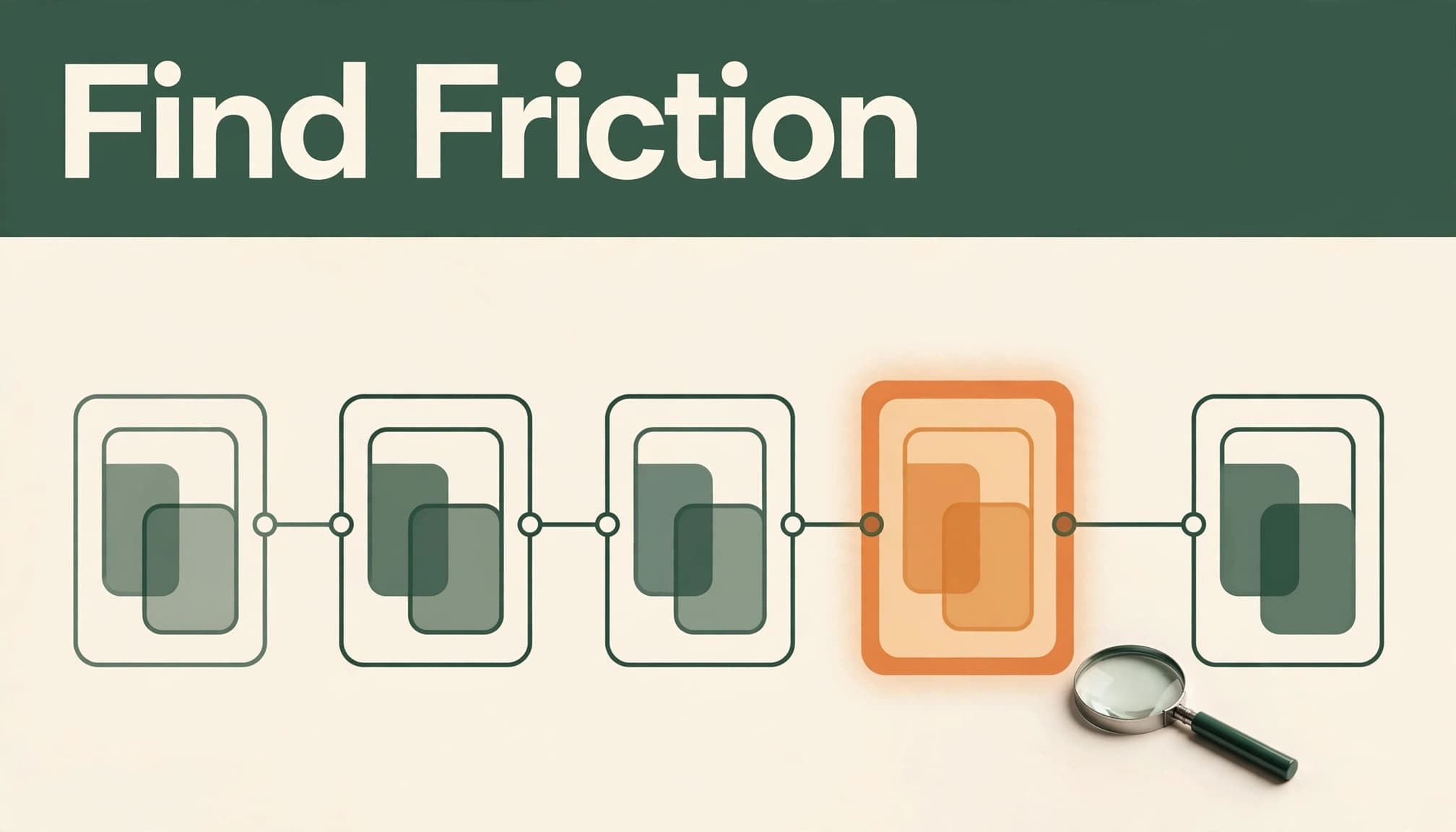
Copy revisions work best when they begin with behavior, not a blank prompt. Session recordings, search logs, product analytics, form analytics, support tickets, and usability testing can show where people pause or fail.
A replay may show visitors opening a help panel before entering a postal code. Form data may show a field with unusually high correction rates. Search logs may reveal failed searches in the search bar, or that people can't find account cancellation or shipping details.
These patterns identify a moment worth investigating. They don't prove that words alone caused the problem. A confusing price, missing requirement, slow page, or broken control can create the same behavior.
Editors should inspect the actual screen, its validation rules, and the path after the click. If a form rejects a valid address, a friendlier error message won't fix the defect. A search bar that returns irrelevant results may also hide the account action users need.
The strongest review pairs interface evidence with a task statement. For example: "A returning customer must be able to find an invoice and download it without contacting support." That statement gives AI a bounded assignment and gives reviewers a standard for judging its output.
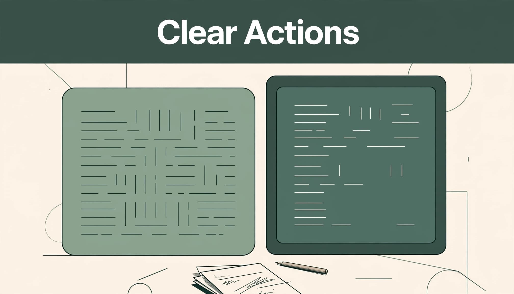
UX writers can use AI to generate and compare interface-copy options, including microcopy for UX. AI can accelerate drafts, but it can't observe hesitation, verify the live interface, or confirm a user's current state.
A useful brief names the user, task, component, trigger, consequences, restrictions, and approved voice. For multi-step flows, it should state the current step and how it appears in the progress tracker. It should also include banned claims and examples of accepted language.
For a subscription cancellation screen, the prompt should state whether cancellation is immediate, whether access continues through the billing date, and whether a confirmation email is sent. Without those facts, a polished draft may mislead.
Teams can also provide a short style guide and approved component examples. The same discipline that helps writers develop stronger writing skills helps product teams reduce generic, mechanical phrasing.
Ask for three to five alternatives with a stated reading level and character limit. Request a plain-language version before requesting a playful one. The editor should then check every option against product rules and the rendered component.
Session replays and proprietary customer data require care. A custom model or approved internal system should receive only data the organization is permitted to process. Redacted behavior patterns are usually more useful than raw recordings, names, addresses, or payment details.
The edit should shorten language where possible, but brevity isn't the goal. A two-word label that hides a financial consequence is worse than a longer label that states it plainly.
Outcome-based labels reduce guesswork. They also make component libraries more consistent, because the same verb can represent the same action across the site.
Interface element | Generic AI draft | Clearer revision |
|---|---|---|
Button | "Submit" | "Create account" |
Navigation label | "Resources" | "Help center" |
Call to action | "Get it now" | "Download the 2026 survey" |
Search bar | "Search" | "Search invoices" |
"Download the 2026 survey" is more useful than "Get it" because it identifies both the action and the destination. A search bar labeled "Search invoices" tells people what they can find. A playful brand voice can appear elsewhere, but the control should retain its functional meaning.
A field label names the required information. Autocomplete fields can speed entry, but autocomplete behavior mustn't replace a visible field label or explain what information is required. Placeholder text should illustrate format or content, not replace the label. Helper text can explain why the data is needed before the field becomes a problem.
Interface element | Generic AI draft | Clearer revision |
|---|---|---|
Form field | "Enter details" | "Work email address" |
Helper text | "We value privacy" | "Used only to send your receipt" |
Error message | "Invalid input" | "Enter a 5-digit ZIP code" |
Good error messages identify the problem and state how to fix it. "Payment failed" gives no recovery path. "Your card was declined. Try another card or contact your bank" gives a person a next action without falsely promising a result.
Accessibility depends on whether a person can perceive, understand, and operate the published interface. WCAG is a reference point for accessibility standards, not proof that the published page conforms.
The WCAG 2 overview frames accessibility around content that is perceivable, operable, understandable, and robust. For microcopy, that means avoiding directions such as "click the green button on the right" when words can name the action instead.
Every button, link, and input needs a clear purpose. Screen readers may announce controls out of context, so "Learn more" and "Click here" often fail to identify a destination. A search bar needs an accessible name that communicates its purpose. An icon-only button may need an accessible name; MDN's aria-label guidance explains one way to provide one for a button.
Error identification and instructions matter as much as attractive wording. EN 301 549 references WCAG criteria for error identification and labels or instructions, both central to form design.
Automated scans and usability testing can catch some missing labels and contrast problems. They can't judge whether an error explains a fix or whether a heading accurately describes its section. Editors should test the rendered page with screen readers, keyboard-only navigation, visible focus, and responsive behavior using tools such as NVDA, JAWS, or VoiceOver.
A witty phrase can make an empty state feel less sterile. It shouldn't turn a destructive action into a surprise or soften a warning about fees, lost access, or deleted data.
"Delete project" is clear. "Send it to the void" may be amusing, but it fails when the action permanently removes shared work. A stronger version keeps both ideas: "Delete project permanently. This can't be undone."
The same principle applies to checkout flow language. "Unlock your plan" sounds upbeat, yet it can obscure a recurring charge. "Start monthly subscription" states the transaction. Supporting copy can then explain the price, billing cycle, and cancellation terms.
Approved verbs, punctuation rules, reading level, and prohibited claims should live with the component library. Editors can give AI those rules, then compare its drafts with recent published screens.
Consistency also means preserving meaning across channels. A confirmation in an email, browser notification, and account page should not give conflicting instructions. AI can detect terminology drift, but a human reviewer must decide which term matches current product behavior.
A/B testing can reveal whether a revised phrase helps, but it can't rescue a weak experiment. Changing a headline, button color, and call to action together makes the result difficult to interpret.
For a checkout form, track completion, field-level errors, backtracking, and contacts related to payment or delivery. For a search bar, track successful searches, reformulations, and exits.
For onboarding copy, measure whether people complete the setup task after responding to the call to action, or return to the same help topic. A progress tracker can show where people stop during a multi-step setup path.
Product analytics can quantify these behaviors. Usability testing adds direct observation and helps explain why people hesitate.
Conversion rates matter when the action is commercial. Yet task completion and successful recovery often tell a clearer story about whether the interface made sense.
Teams that publish at scale need approved prompts, accessible components, a defect log, and reviews before and after CMS publication. Themes, plug-ins, embeds, and responsive layouts can change reading order or control behavior after copy approval.
A release review should also confirm that links, button labels, captions, PDFs, and embedded content still communicate their purpose in context.
Before publication, editors should confirm that:
Each button and call to action states the resulting action or destination.
Form labels remain visible, while helper text explains format, purpose, or limits.
Every error names the issue and gives a realistic recovery step.
Navigation labels describe what a person will find after selecting them, and each search bar prompt explains what people can search for and what results to expect.
No warning relies on color, placement, an image, or an inside joke alone.
Claims about price, access, privacy, and deletion match current product behavior.
Keyboard, mobile, rendered-page, and screen-reader checks are complete.
Dark patterns, such as misleading opt-outs or disguised recurring charges, have been removed.
No. AI can draft alternatives quickly, but it doesn't know whether a label matches the live interface, business rules, user expectations, or accessibility behavior. An editor must verify the final wording on the rendered page.
A useful message identifies the affected field or action, explains what went wrong, and gives a specific correction. It should preserve entered information when possible and avoid blaming the person using the form.
Teams should use replays to spot repeated hesitation, failed actions, and unclear paths. They should then compare those observations with analytics, support themes, and usability sessions before changing copy. Privacy rules and data minimization should govern any material used in prompts.
Compare query behavior with a review of the rendered interface and usability testing. Unclear results may indicate a product problem, not just a wording issue. Review filters, content coverage, and interaction states before changing the copy.
The strongest AI website microcopy does not sound clever in isolation. It improves the user experience by helping people understand what will happen, complete the task, and recover when something goes wrong.
AI can accelerate the first draft. Human review, accessibility testing, and measured results determine whether microcopy for UX works in the interface where it matters.